How well does the Model Fit the data?
The basic idea of this concept is to make a prediction about the data (or anything in fact that can be turned into data). You will see later how model or fit can be applied to this concept. It is the prediction compared to the actual obtained scores. The mean can be used as a prediction. For example, you might be asked to guess how much Fred weighs. If that is all the information you have your best guess would be the average weight of men. One the other hand if you also knew how tall Fred was then your guess could be much improved. Such improvement is the focus of this section. The prototype will be the regression line. It is the basis of the general linear model.
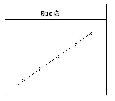
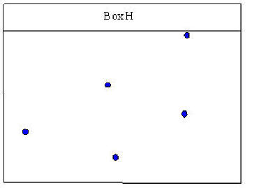
In Box H it is not as clear where to draw a line that would pass through all of the points.
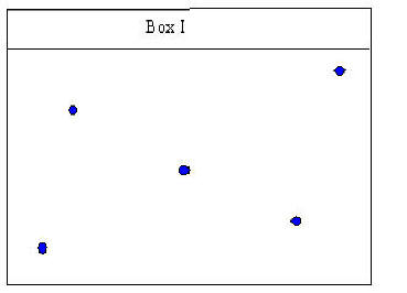
Box I is similar in that one does not quite know where to draw a line that will be the closest to all of the points in the box.
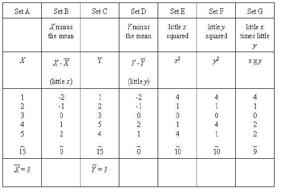
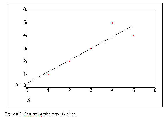
Using the results of these two formulae we can now plot the regression line. In order to keep use connected to the task of learning to use the computer and SPSS the graph is generated from the SPSS package. The following set of data will be used in this example (you have seen it before).
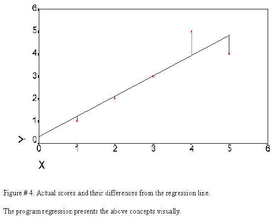
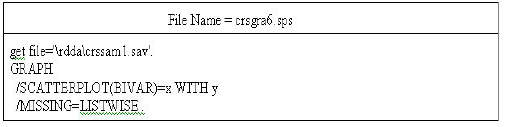
This regression can now be plotted as a regression that is the line that comes closest to the points of the scatterplot. The SPSS program will plot everything but the regression as seen in the following Figure. The following syntax file will produce a plot that will include everything but the regression --that has been drawn in for ourt purposes.
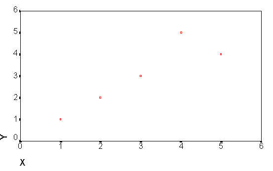
The following is the produced.
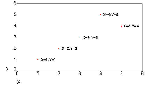
The next plot is the same plot that contains further explanation of the data points.
Y' = Y primed = a + (b times X).
The model is obtain in the following manner: (1) find a straight which passes closest to all of the points of the variables when they are plotted on the x and y axis. (2) Use this line to predict y scores from the x scores. (3) The difference between the predicted score and the actual score is the error. (4) Square each error score and sum the squares. (5) Compare the sum of squares error to the total sum of squares. The comparison will result in relationship of the variables or the fit. There are no new computations here -- it has all been done in the above example. Only the concept is added. The correlation itself indicates the fit. This is another way to conceptualize the relationship. It becomes useful in the conceptualization of complex multivariate statistics.
The regression line
Click on Graphs
Click on Scatter
Click on Simple
Click on Define
Select X variable
Click on the Delta Button to move the variable into the X-axis box
Select Y variable
Click OK
Double Click on the chart itself
Click Chart
Click Options
Click Total
Click OK