The correlation and regression can be shown graphically in terms of the General Linear Model to develop understanding.
The correlation and regression can be shown graphically to develop understanding.
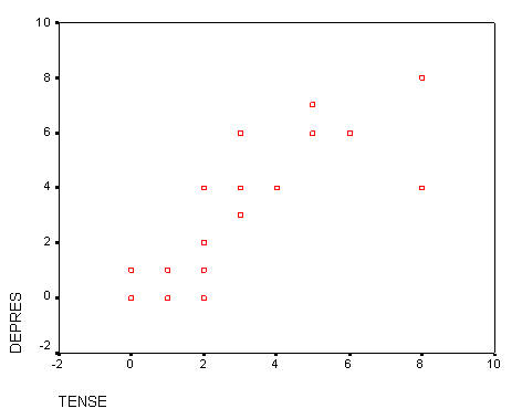
This scattergram represents all of the respondents on the items of TENSE and DEPRES. People who responded with smaller numbers to the item TENSE also responded with smaller numbers to DEPRES. At the same time people who responded with larger numbers to TENSE also responded with larger numbers to DEPRES. This plot represents two variables DEPRES and TENSE. Person 16 answered both questions 0. Persons 12 and 14 answered both questions 8. Person 6 responded 2 to TENSE and a 0 to DEPRES. You might want to identify some more of the cases to convince yourself of the relationship of the data to the plot
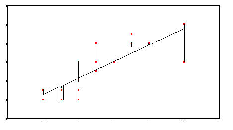
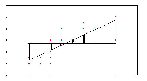
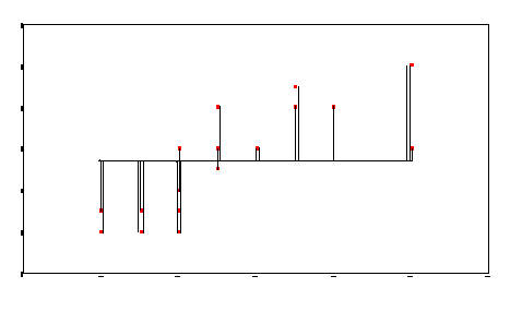
The next three plots all have the same data as the previous but have modifications drawn to show characteristics of the correlation or regression. The next plot shows the sum of squares due to error or residual. It is the error in predicting Y from X. TENSE is the X variable and DEPRES is the Y variable.